Guidelines
Developing large format graphics may pose some new challenges for many graphic designers. For the most part trade show graphics require the same creative and layout skills and software or graphic guidelines, but there are differences related to the resolution of images that need to enlarge to many times their original size.
Below are key factors or graphic guidelines that may be helpful to know to go into large format graphic design for trade show graphics. If by chance these guidelines don’t provide what you need to know, give us a call, we will get you the proper answer so you can build your art files knowing they are correct for the size and materials of your rental booth.
File Type
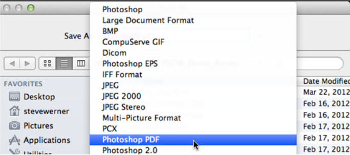
Most designers use Adobe Photoshop/Illustrator and some international designers use InDesign. The preferred method for building print ready Trade Show art files seems to be the use of Illustrator as the foundation where all text and shapes are created, and easily resized without any loss of quality. Images are adjusted in Photoshop, then imported onto the Illustrator document and positioned and sized.
We can accept all Adobe files, but we prefer PDF’s as they avoid the issues of linked fonts or images.
- PDF's are the preferred format for all print ready trade show graphics
- Illustrator is the most common graphics application
- Enlarging photos is the primary challenge
Bleed Margin
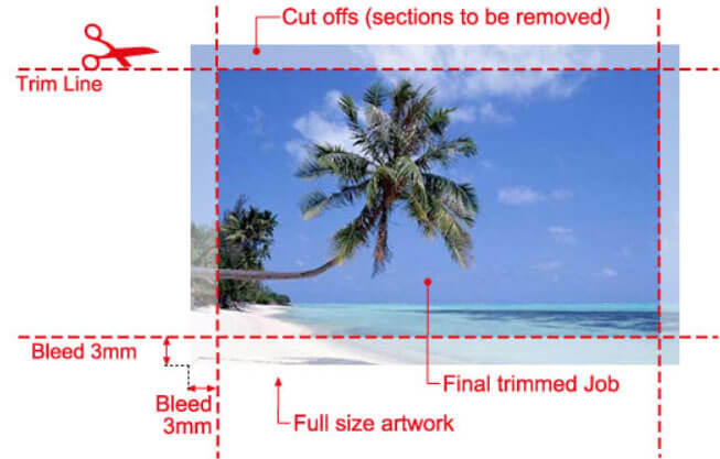
Bleed Margin says that you are actually making your image slightly larger than the final size you need.
Adding bleed is the same as saying adding a half inch extra border.
The art will typically have guidelines or registration marks showing finished size.
The bleed portion is there just in case a little extra is needed to sew into a seam, or tuck into a frame.
- Often bleed margin is not required
- Define margin when your art includes bleed
Scaling to Fit
Ideally, you would build your art files to be the full 100% print size.
This assures the size of the final printed product is correct and the quality is as intended.
Designers scale art primarily because large format graphic files become larger than their computer can handle.
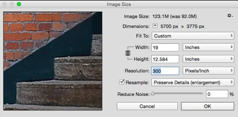
The solution is to build the art smaller with twice the resolution so the printer can enlarge the file to the proper size and resolution.
When you need to do this, make sure your math is correct for both resolution and scale so that the result is a print-ready art file, at the correct size, and with a minimum PPI of 150.
- Build at 100% print size when possible
- Build at 50% with double the resolution
Warning! What to avoid
If you want a clear, detailed trade show graphic, then start with images that will hold their detail when enlarged to the size you need. Photoshop and other programs allow you to enlarge your image and view it as “Actual Size” to show you on your monitor how the image will look when you’re standing up-close looking at it in person.
When a high-quality image loses its quality, it may get grainy or blurry. When a low-quality image loses its quality, it starts to pixelate and small boxes become visible around the details and edges. Sometimes a small amount of distortion is acceptable, especially if you can’t get a better image. Start with a great image, be flexible and find a different image of better quality if your first choice is of poor quality. Shutterstock sells high-quality images ready for download and most of these will work just fine for use in your booth graphics.
- Screen images for quality as you choose them
- Enlarge images and evaluate quality early
- Use "Actual Size" tool to evaluate quality
- Consider Stock Images as an option
Saving your video file
Save your video in either an MP4 or MPEG format.
These are different options and for hardcore video people MPEG is preferred as its more than a compression container.
However, MP4 works just fine and is the most common format we receive for video files.
Most video players such as Novastar and VLC and Windows media player will play MP4 just fine.
- Smart Innivations
- Extensive Rental Inventory
- Comprehensive CAD Library
- Unlimited Revisions
Building Videos LED Tv’s
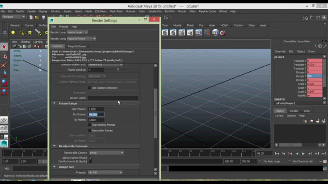
Most looping videos are a combination of video footage, backgrounds, and text with an audio track time to play with the video.
Maya is the preferred software to bring these elements together into a great looking video.
Maya has modeling capabilities powerful enough to create a photorealistic model of your product and animation capabilities that can show your product in fluid realistic motion.
Consider the limited attention span of attendees on the show floor and work to quickly deliver a high impact video message that loops often, 1-2 minutes seems about the idea length.
- Smart Innivations
- Extensive Rental Inventory
- Comprehensive CAD Library
- Unlimited Revisions
